

Table of Contents
- Why the Right Art for Walls Changes a Room
- How to Choose Wall Art That Suits Your Space
- Art Print Sizes: Getting the Scale Right
- Gallery Wall Ideas That Look Curated, Not Cluttered
- Art Prints for Living Room Walls: A Practical Plan
- Can Bold Colour-Splash Art Work in a Minimalist Home?
- Common Mistakes When Buying Art for Walls
- Frequently Asked Questions
Last Updated: October 5, 2026
Why the Right Art for Walls Changes a Room
The right art for walls does more than fill empty space. It sets the mood, anchors your furniture, and makes a room feel finished rather than half-done. At Bella Leaf Studio, we hear the same thing from customers again and again: a single bold print can transform a plain room faster than new paint or furniture.
So why do so many people get it wrong?
Most shoppers buy art the way they buy a cushion. They see something they like, order it, then wonder why it looks lost on a big wall or fights with the sofa. The problem is almost never the print itself. It is the match between the print and the space.
Below, we break down exactly how to choose art for walls that suits your home, from size and colour to gallery wall layouts. We will also cover the mistakes that waste money and the simple fixes that save a room.
How to Choose Wall Art That Suits Your Space
Choosing wall art starts with the room, not the print. Look at your wall size, your existing colours, and how you use the space before you browse a single listing.
That order matters. When you pick the print first, you end up forcing it into a room it does not fit. When you start with the room, every decision after that gets easier.
Start With the Room, Not the Print
Take a photo of the empty wall. Note the light, the wall colour, and the biggest piece of furniture nearby. A north-facing room stays cool and dim, so warm tones lift it. A bright south-facing room can handle deeper, richer colour.
Ask three questions:
- How wide is the wall, and what furniture sits against it?
- What colours already appear in the room?
- Will this art be seen up close or from across the room?
Answer those and you have a brief. Now you can shop with a purpose.
Colour, Theme and Finish: What Actually Decides It
Colour ties art to a room. Pull one or two shades from your existing scheme and let the art repeat them. A teal and burnt orange botanical, for example, works beautifully in a room with a teal throw or an oak side table.
Theme matters less than people think. You do not need coastal art in a coastal home. You need art that shares a mood with the space.
Finish changes how a print reads:
- Matt suits soft, calm rooms and hides glare.
- Satin adds a gentle sheen with balanced contrast.
- Gloss makes colour pop but reflects light and shows fingerprints.
In practice, matt and satin suit most homes. Save gloss for a hallway or a room with controlled light.
Art Print Sizes: Getting the Scale Right
Art print sizes are measured in standard paper formats, and getting the scale right matters more than the style. A print that is too small makes a wall look bare; one that is too large overwhelms the room.

A common rule is that art should cover roughly two-thirds to three-quarters of the width of the furniture below it. Above a sofa, that means a single large print or a group of smaller ones spanning most of the sofa's length.
Standard Sizes and Where They Work Best
|
Size |
Dimensions |
Best For |
|---|---|---|
|
A5 |
148 × 210 mm |
Small gaps, shelves, grouped sets |
|
A4 |
210 × 297 mm |
Desks, hallways, tight spaces |
|
A3 |
297 × 420 mm |
Bedside walls, small gallery walls |
|
A2 |
420 × 594 mm |
Sofa walls, statement pieces |
A2 is the workhorse for a main wall. A3 and A4 shine in pairs or grids. A5 is best used in groups, never alone on a large wall.
Gallery Wall Ideas That Look Curated, Not Cluttered
A gallery wall works when it follows one clear rule. Pick a single anchor: a shared colour, a shared frame, or a shared theme. Break that rule and the wall looks like a jumble.
Our favourite approach for a curated look:
Eucalyptus Watercolour Art Print – Soft Green & Blue Botanical Illustration →
- Choose one large piece as the anchor.
- Add three to five smaller prints around it.
- Keep frames in one or two finishes, such as black and oak effect.
- Leave even gaps of 5 to 8 cm between frames.
- Lay the whole arrangement on the floor first.
Mixing sizes is fine. Mixing everything at once is not. If your prints share a colour family, you can vary size freely. If they share a size, you can vary subject.
For a calmer result, use a grid. For a looser feel, use a salon-style layout with a strong anchor in the middle.
Art Prints for Living Room Walls: A Practical Plan
Art prints for living room walls should be the largest in your home. The living room is where you spend the most waking hours, and the main wall usually sits behind the sofa. Give it the biggest piece you can afford.
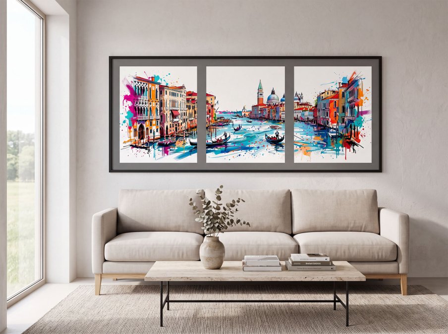
Here is a simple plan we give customers:
- Measure the sofa width and the wall height.
- Mark the two-thirds width on the wall with tape.
- Choose one A2 print or a set of three A3 prints.
- Match the frame to your existing metal or wood tones.
- Hang, step back, and adjust before you commit to nails.
If the wall feels empty after that, add a second, smaller piece to one side. Do not simply shrink the gap by crowding the main print.
Can Bold Colour-Splash Art Work in a Minimalist Home?
Yes, and it often works better than a neutral print. A minimalist room needs one point of interest, and a bold colour-splash piece provides exactly that without adding clutter.
The trick is restraint everywhere else. Keep the walls plain, the furniture simple, and let the art carry the colour. One strong print on a white wall reads as deliberate. Three of them read as noise.
This is where our own approach comes in. Our prints use expressive watercolour leaves and splashes, so a single piece can hold a whole room. The Eucalyptus Watercolour Art Print is a good starting point for neutral homes, with soft green and blue leaves that calm a space rather than shout at it.
If you want more energy, the Modern Botanical Coloursplash Art Print brings teal, turquoise and burnt orange into the room while keeping the composition clean.

Common Mistakes When Buying Art for Walls
Most buying mistakes come down to scale, colour, or planning. Fix those three and almost everything else falls into place.
The errors we see most often:
- Buying too small. A single A4 on a large wall looks like a stamp. Size up.
- Ignoring the frame. A cheap frame drags down a good print. Match the finish to the room.
- Hanging too high. Art floats when it sits above eye level. Lower it.
- Skipping the mock-up. Tape paper templates to the wall before you buy or drill.
- Forgetting the light. Gloss plus direct sun equals glare. Choose matt or satin instead.
- Buying a set that clashes. Sets work when they share a palette, not just a theme.
One more point on quality. It is worth asking how a print is made before you pay more for it. Our prints are made in-house using fine-art paper and archival pigment inks, which is why the colour holds and the detail stays crisp. The Abstract Leaf Print is a good example: rich colour depth, a gallery-quality finish, and a palette that suits modern rooms.

Prints also need to survive the post. Unframed prints travel rolled in sturdy tubes, and framed prints are packed flat with care. That matters if your art is a gift or has a long journey ahead of it.
Choosing art for walls can feel like a guessing game, but it does not have to be. Measure the wall, match the colour, get the scale right, and the rest falls into place. At Bella Leaf Studio, we make that easier with in-house fine art printing, a bold colour-splash style, and packaging built to travel well. Browse our premium art prints and framed options, and give your walls the piece they have been missing. Get started with Bella Leaf Studio and turn a plain wall into the best part of the room.
Frequently Asked Questions
How do I choose art for my walls?
Start with the room rather than the print. Note the dominant colours, the light levels and how much wall space you actually have. Then pick a theme that fits how the room is used, a size that fills roughly two-thirds to three-quarters of the wall width above a piece of furniture, and a finish that suits the light. Matt works well in bright rooms because it does not reflect, while gloss gives more vibrancy in softer light.
What size art should I put on a wall?
As a working rule, art hung above a sofa or bed should span about two-thirds of the furniture's width, leaving the centre of the artwork at roughly eye level. Standard art print sizes make this easier: A5 (148 x 210 mm) suits small gaps and shelves, A4 (210 x 297 mm) works for narrow walls, A3 (297 x 420 mm) is a good all-round choice above a desk or chest of drawers, and A2 (420 x 594 mm) fills a large wall or a gallery wall centrepiece.
Can you mix different styles of wall art?
Yes, and mixed walls often look more personal than matched sets. The trick is to hold one or two elements constant, such as frame colour or a shared colour palette, while varying the artwork itself. Bella Leaf Studio's botanical prints work well for this because they share a colour-splash aesthetic across different palettes, so a soft eucalyptus piece sits naturally beside a bolder teal and burnt orange abstract.
How do I arrange prints on a gallery wall?
Lay the arrangement out on the floor first and photograph it before anything goes on the wall. Keep gaps consistent, usually 50 to 80 mm between frames, and anchor the whole group so its centre sits at roughly eye level. A common approach is a large A2 or A3 anchor print in the middle with smaller A4 or A5 pieces around it. Bella Leaf Studio framed prints arrive assembled with acrylic glazing, which keeps the weight down and makes a multi-frame layout easier to hang.