

Table of Contents
- Why Independent Art Print Shops Matter
- Bold Colourful Wall Art That Works in Any Interior
- Wildlife and Nature Prints: Stag, Kingfisher, and Whale Designs
- Coastal and Architectural Prints: Beach Huts, Whitby, and Historic Landmarks
- How to Style a Gallery Wall with Bold Colour-Splash Art
- Art Prints by Colour: Choosing the Right Palette for Your Space
- Quality You Can Trust: In-House Printing and Archival Standards
- Frequently Asked Questions
Last Updated: 14 October 2026
Why Independent Art Print Shops Matter
Finding truly distinctive wall art that speaks to your home's personality is harder than it should be. Mass-market retailers churn out the same prints by the thousands. Chain stores stock what sells fastest, not what's beautiful. Independent art print shops, by contrast, curate collections with intention. They champion artists, experiment with bold colour palettes, and refuse to play it safe with beige and grey.
The difference shows immediately. Independent shops stock pieces you won't find in every other home. They understand that bold colourful wall art isn't just decoration, it's a statement about who lives there. Many independent retailers also offer better quality control, archival-grade printing, and personal service that mass retailers simply can't match. According to research on independent retail trends, customers report higher satisfaction and stronger emotional connections to purchases from independent businesses compared to chain alternatives.
Bella Leaf Studio exemplifies this approach. The brand specialises in creating premium art prints featuring a distinctive bold, colour-splash design aesthetic, with every piece printed in-house using archival pigment inks on fine-art paper. This commitment to quality and originality is what separates independent studios from the high street.
Bold Colourful Wall Art That Works in Any Interior
The biggest concern people have about bold colourful wall art is simple: will it actually fit my space? The fear is real. A vibrant, expressive print that looks stunning online might clash with your existing décor or feel overwhelming on your wall.
Here's what actually happens: bold colour-splash art works in almost any interior because the style itself is designed for versatility. The key is understanding what "bold" actually means. It's not about loud or chaotic. It's about confidence, pieces that use rich colour and dynamic brushwork to create energy and movement. A well-executed bold print adds character without demanding that everything else in the room match it.
The secret is in the composition. Expressive watercolour-style prints with splashes of colour against softer backgrounds create visual interest without aggression. Think of a kingfisher rendered in vibrant blues and oranges, or a whale breaching with dynamic brushstrokes. These pieces work because they balance detail with movement, warmth with cool tones.

Modern interiors, minimalist flats, traditional homes with period features, bold colourful wall art adapts to all of them. The trick is choosing pieces that resonate with your aesthetic, then trusting that quality design will integrate naturally. The Expressive Coloursplash Kingfisher Print works equally well in a contemporary office or a cottage sitting room because the artistic execution transcends style boundaries.

Wildlife and Nature Prints: Stag, Kingfisher, and Whale Designs
Wildlife and nature-themed bold colourful wall art has a particular power. Animals rendered in expressive, painterly styles feel alive on the wall. They draw the eye and start conversations.
The stag is a classic subject for good reason. There's something about a majestic woodland creature that commands respect. The Stag in Forest Coloursplash Print captures this perfectly, a striking watercolour artwork with soft forest greens and earthy browns giving way to vivid bursts of pigment. The whole scene feels alive with movement.

Kingfishers offer a different appeal. These small, brilliant birds are nature's jewels, and capturing them in bold colour-splash style is an obvious choice. The Expressive Coloursplash Kingfisher Print uses rich blues, warm oranges, and teal accents to create a fresh, modern aesthetic.
For those drawn to the ocean, the Whale Breaching Print captures something primal. A humpback whale in full flight, painted with bold coloursplash strokes and dynamic brushwork. The abstract, painterly style brings movement and energy to any interior, perfect for offices, studios, or homes that love dynamic, statement artwork.
All three pieces share a commitment to quality. In-house printing using archival pigment inks means these prints won't fade or yellow over time. They're designed to last, which matters when you're investing in art for your home.
Coastal and Architectural Prints: Beach Huts, Whitby, and Historic Landmarks
Coastal and architectural subjects give bold colourful wall art a sense of place. These pieces remind you of somewhere meaningful or transport you somewhere you love.
Stag in Forest Coloursplash Print – Wildlife Wall Art →
Beach huts are inherently cheerful. Rows of colourful wooden structures along the shoreline have an almost nostalgic appeal, even for people who've never lived by the sea. The Expressive Coloursplash Beach Huts Print celebrates this charm with lively brushstrokes and bold seaside hues. Bright blues, yellows, pinks, and turquoise tones create a joyful, modern coastal aesthetic.
Historic landmarks offer something deeper. These are places with real character, real history. The Whitby Coloursplash Art Print captures one of North Yorkshire's most iconic seaside towns with vibrant, watercolour-inspired composition.
For those with Yorkshire connections, the Bolton Abbey Ruins Print celebrates one of the Dales' most breathtaking landscapes. Bold brushwork and expressive colour capture the timeless beauty of the 12th-century priory and sweeping riverside meadows.
The Chester Eastgate Clock Print and Stockport Print bring similar energy to urban landmarks. These aren't generic city prints, they're specific places rendered with bold colour and dynamic energy.
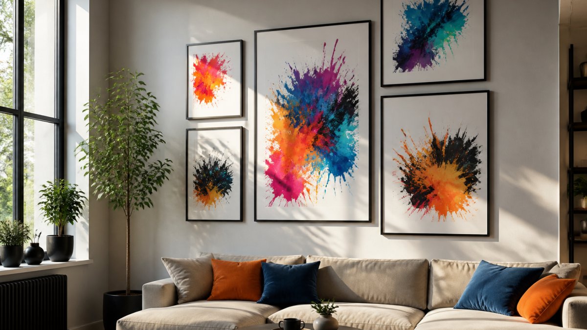
How to Style a Gallery Wall with Bold Colour-Splash Art
A gallery wall done well is a conversation starter. Done poorly, it's visual chaos. The difference is planning.
Start by choosing a theme or colour palette that ties your pieces together. This doesn't mean every print has to be the same colour, it means they should speak to each other. A collection of wildlife prints works. A mix of coastal and landscape pieces works.
Lay everything out on the floor first. Arrange your prints in different configurations before putting a single nail in the wall. Take a photo of what you like, then use that as your guide.
Consider the wall space itself. A gallery wall works best on a wall that can breathe, not one cluttered with furniture or competing focal points. A hallway, an office, or a living room accent wall all work beautifully.
| Element | Best Practice | Why It Matters |
|---|---|---|
| Spacing | 5-8 cm between frames | Creates visual rhythm without feeling cramped |
| Frame Style | Consistent or complementary | Unifies the collection; all black, all white, or mixed neutrals work best |
| Frame Size | Mix large and small pieces | Prevents monotony; creates visual interest and flow |
| Arrangement | Asymmetrical or grid | Asymmetrical feels curated; grids feel intentional |
| Lighting | Natural light or spotlights | Bold colour-splash art needs light to shine |
Mix frame sizes and orientations. A wall of identically-sized prints feels static. Combine A3 and A4 sizes, landscape and portrait orientations. This creates movement and visual interest. All three finishes, matt, satin, and gloss, work in a gallery wall. Matt feels modern and sophisticated. Satin offers balance.
Lighting matters more than people realise. Bold colourful wall art needs light to truly shine. Natural light is ideal, but even a simple picture light above the gallery wall transforms how the pieces look. The colours become richer, the details sharper.
Art Prints by Colour: Choosing the Right Palette for Your Space
Colour is the most powerful tool in interior design, and choosing the right palette for bold colourful wall art determines whether a piece enhances your space or fights with it.
Blues and teals work almost everywhere. These colours are calming yet sophisticated. The Kingfisher Print with its rich blues and teal accents fits seamlessly into modern interiors, coastal homes, and even traditional spaces. Blues pair beautifully with warm wood tones, white walls, and neutral furnishings.
Warm tones, oranges, yellows, and warm reds, bring energy and movement. These colours work brilliantly in spaces that need life. A kitchen, a home office, or a playroom benefits from these hues. The Beach Huts Print with its yellows, pinks, and bright blues adds instant warmth and cheerfulness.
Greens and earth tones feel grounded and natural. The Stag in Forest Print with its forest greens and earthy browns creates a sense of calm and connection to nature. These colours work particularly well in bedrooms, studies, and spaces designed for relaxation.
Stag in Forest Coloursplash Print – Wildlife Wall Art →
Mixed palettes, pieces that combine multiple colours, offer flexibility. The Whitby Print and York Print use splashes of blue, orange, yellow, pink, and green. These pieces work in almost any interior because they contain enough colour variety to complement different palettes.
The Lake District Print demonstrates how nature-inspired colour palettes, rolling hills, peaceful lakes, dramatic skies, feel at home in contemporary and neutral interiors alike.
Quality You Can Trust: In-House Printing and Archival Standards
This is where independent studios prove their worth. Bella Leaf Studio prints every piece in-house using archival pigment inks on premium Marrutt fine-art paper. This matters far more than most people realise.
Archival pigment inks don't fade. They're engineered to last decades without yellowing or losing colour vibrancy. Cheap inks fade noticeably within 5-10 years. Archival inks maintain their richness for 50+ years.
The paper matters equally. Marrutt fine-art paper is premium stock, smooth, acid-free, and designed to hold ink beautifully. It's the paper professional galleries use. It feels substantial in your hands and looks gallery-quality on your wall.
In-house printing means quality control. Every print is inspected before it ships. Colours are consistent. Details are crisp. There's no middleman, no outsourcing to a generic print factory.
Three finish options, matte, satin, and gloss, let you choose how the piece interacts with light. Matte is modern and non-reflective, ideal for offices and contemporary spaces. Satin offers balanced contrast and a gentle sheen.
Unframed prints arrive rolled in sturdy tubes, protecting them during transit. Framed prints come flat and securely packaged. The commitment to packaging quality reflects a commitment to the customer experience.
Finding bold colourful wall art that truly stands out requires looking beyond the high street. Get started with Bella Leaf Studio and transform your walls with vibrant, gallery-quality art that reflects your unique style.
Frequently Asked Questions
Where can I find independent UK shops for bold colourful wall art?
Independent art print shops offer unique, hand-crafted designs you won't find in mass-market retailers. Bella Leaf Studio specialises in bold colour-splash artwork printed in-house using archival pigment inks on premium fine-art paper. Their range includes wildlife prints like the Stag in Forest and Kingfisher designs, coastal pieces such as the Beach Huts print, and architectural prints of landmarks like York Minster and Chester's Eastgate Clock. Each print is available in multiple sizes from A5 to A2, with options for professional framing.
How do I know bold colour-splash wall art will suit my modern, minimalist home?
Bold colour-splash art works brilliantly in minimalist interiors when you treat it as a focal point rather than background decoration. Choose one striking piece for a feature wall, or create a curated gallery wall with 3-4 prints in complementary colours. The key is balance: pair vibrant prints with plenty of white space and neutral furnishings. Matt finishes create a softer, more contemporary feel than gloss, making them ideal for minimalist schemes. Start with one piece to test how it feels in your space.
What should I look for when buying art prints online to ensure quality?
Look for shops that print in-house using archival pigment inks on premium fine-art paper, as these ensure colours remain vibrant for decades. Check that prints are carefully packaged for safe delivery, unframed prints should arrive rolled in sturdy tubes, whilst framed pieces should be packaged flat and securely. Ask whether the studio uses professional-grade materials and whether they offer multiple finish options (matt, satin, gloss). Bella Leaf Studio uses Marrutt fine-art paper and Epson archival pigment inks, with secure packaging and framing assembled in-studio.
Can I order bold colour-splash prints and have them arrive undamaged?
Yes, when you order from shops with proper packaging protocols. Bella Leaf Studio ships unframed prints rolled in sturdy tubes to protect them during transit, and framed prints are packaged flat with secure protection. This approach minimises the risk of damage. If you're ordering artwork online, always check the seller's packaging methods and delivery insurance before purchasing. Quality independent shops take pride in ensuring their artwork arrives in perfect condition.