

Table of Contents
- Start With the Style: What Modern Landscape Prints Actually Look Like
- How to Choose Landscape Prints for Living Room Spaces
- Sizing Up: When Large Landscape Wall Art Works Best
- Landscape Gallery Wall Ideas That Look Considered, Not Cluttered
- Abstract Landscape Prints: The Boldest Way to Add Colour
- Framing, Hanging Height and Finish: The Details That Decide the Look
- Common Mistakes to Avoid When Buying Landscape Prints
- Frequently Asked Questions
Last Updated: October 18, 2026
Start With the Style: What Modern Landscape Prints Actually Look Like
Modern landscape prints for home are artworks that take hills, coastlines, lakes and mountains and reinterpret them through a contemporary eye, using bold colour, simplified shapes or clean photography instead of traditional painterly realism. At Bella Leaf Studio, the whole range is built around this idea: familiar scenery, rendered in a way that feels current rather than nostalgic.

The style question matters more than the size question. Get the style wrong and no frame will save it.
Two families dominate the market, and most prints sit somewhere between them.
Colour-splash and watercolour-inspired landscapes
Colour-splash landscapes push pigment to the front. Shapes stay loose, skies become washes of orange and violet, and hills are built from overlapping blocks of saturated colour. Watercolour-inspired work is softer but follows the same logic: atmosphere first, detail second.
These prints suit rooms that need energy. A neutral hallway or a plain white living room gains an instant focal point. The Tate's guide to modern landscape art is a useful primer on how landscape moved away from strict realism.
Photographic and minimal modern landscapes
Photographic and minimal landscapes work the other way. A single horizon, a muted sky, one band of sea. Restraint is the point. These suit busy rooms where the art should calm things down rather than compete.
A common mistake is buying a minimal print for a maximal room and wondering why it disappears. Minimal work needs breathing space around it.
How to Choose Landscape Prints for Living Room Spaces
Choosing landscape prints for living room spaces comes down to three checks: palette, scale and the room's existing focal point. Match the print's dominant colour to something already in the room, size it to the wall rather than the furniture, and never hang it where it fights the television or fireplace for attention.
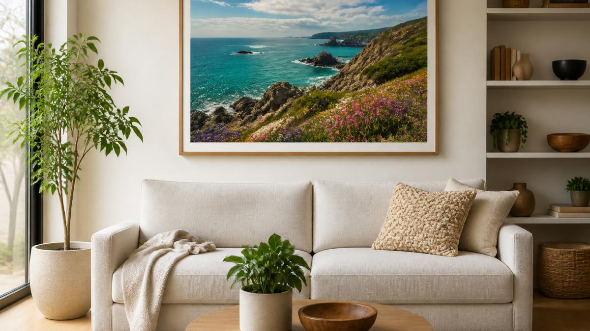
Work through it in this order:
- Palette: pull one colour from a cushion, rug or vase and let the print echo it
- Scale: the print should fill roughly two-thirds of the wall width above a sofa
- Focal point: if the room already has one, the art supports it; if not, the art becomes it
- Light: south-facing rooms wash out gloss finishes, so choose matt there
Bold colour-splash pieces work surprisingly well in minimalist flats. The trick is keeping everything else quiet so the print carries the colour on its own.
Sizing Up: When Large Landscape Wall Art Works Best
Large landscape wall art works best on a wall with at least 1.5 metres of clear space and no competing features. Oversized prints shrink small rooms; they overwhelm narrow hallways and low ceilings. Get the proportion right and a single large piece does more than five small ones.
The rules that hold up in practice:
- Above a sofa: the print spans about two-thirds of the sofa's width
- Above a bed: centred, with the bottom edge roughly 15 to 20 cm above the headboard
- On a narrow wall: go vertical rather than wide
- On a low ceiling: keep the top edge below the ceiling line by a clear margin
A2 at 420 × 594 mm is the sweet spot for most living room walls. A3 handles hallways and smaller alcoves well.
Landscape Gallery Wall Ideas That Look Considered, Not Cluttered
Landscape gallery wall ideas work when the prints share one thing: a colour, a horizon line or a frame style. Random collections look like clutter. Deliberate ones look like a collection. Pick your shared thread before you buy a single frame.
Three layouts that hold together:
- The horizon line: align every print so the horizon sits at the same height
- The colour thread: one accent colour repeats across all pieces
- The grid: equal sizes, equal gaps, calm and architectural
A triptych is the easiest route. One continuous scene split across three panels gives you the impact of a gallery wall with none of the alignment headaches. The Victoria and Albert Museum's collection of landscape works shows how landscape composition has been handled across centuries, which helps when planning a layout.
Lake District Coloursplash Art Print — Modern Landscape Poster →

Keep gaps between frames consistent, around 5 to 8 cm, and treat the whole arrangement as one shape on the wall.
Abstract Landscape Prints: The Boldest Way to Add Colour
Abstract landscape prints strip scenery down to colour, gesture and shape. There is no literal mountain, just the feeling of one. That is exactly why they work in rooms where a realistic scene would feel too literal or too traditional.
Where they earn their place:
- Dark rooms that need lifting
- Rental flats where you cannot change the walls
- Rooms with strong existing colour that needs a companion, not a clash
- Spaces where you want one confident statement rather than a theme
The risk is real, though. Abstract work demands a plain backdrop. Put one above a patterned wallpaper and both lose. Give it a clean wall and it carries the room.
Framing, Hanging Height and Finish: The Details That Decide the Look
Framing, hanging height and print finish decide whether a good print looks expensive or cheap. A black, white or oak-effect frame in a simple gallery profile suits modern landscape work; ornate frames fight it. Hang at eye level, and match the finish to the room's light.
Finish matters more than most buyers expect:
| Finish | Best For | Watch Out For |
|---|---|---|
| Matt | Bright rooms, south-facing walls | Can look flat under warm lamps |
| Satin | Most living rooms, balanced light | Slight sheen at sharp angles |
| Gloss | Darker rooms, maximum colour punch | Reflects windows and glare |
On framing, the practical choice is simple. Unframed prints fit standard shop-bought frames and give you flexibility later. Professionally framed pieces arrive ready to hang, with acrylic glazing that travels far better than glass.
For hanging height, aim for the centre of the artwork at roughly 145 cm from the floor. Above furniture, leave 15 to 25 cm between the top of the sofa or sideboard and the bottom of the frame.
Common Mistakes to Avoid When Buying Landscape Prints
Most buying mistakes happen before checkout, not after. The print arrives, goes up, and something feels off. Usually it is one of these.
- Buying for the screen, not the wall. Screens are backlit; walls are not. Order a small size first if you are unsure.
- Ignoring the room's light. Gloss in a sun-drenched room becomes a mirror by mid-afternoon.
- Sizing to the frame, not the wall. A print can be the right size for its frame and the wrong size for the space.
- Mixing too many styles. One bold piece and four quiet ones beats five loud ones.
- Skipping the shared thread on a gallery wall. Without one, it reads as clutter.
Bella Leaf Studio prints each piece in-studio using archival pigment inks on Marrutt fine-art paper, which is why the colours hold up on a wall the way they do on screen. Every print is packaged flat or rolled depending on size, so it arrives in the condition it left in.
A final check before you buy: does the print suit the room, or does it suit a photo of a room you saw online? Buy for your actual walls.
Frequently Asked Questions
How do I choose landscape prints for my home?
Start with the room and its existing palette, then pick a print that either echoes two or three of those colours or introduces one deliberate accent. Match the style to the space: soft watercolour-inspired pieces suit calm bedrooms, while bold colour-splash designs hold their own in living rooms. Measure the wall before ordering, and choose a size that fills roughly two-thirds of the width above a sofa or sideboard. Order a small size first if you are unsure about colour accuracy on screen.
What size landscape print should I choose for my wall?
Above a sofa or sideboard, aim for artwork around two-thirds the width of the furniture below it. A single A2 print (420 x 594 mm) suits a narrow wall or a hallway, while A3 (297 x 420 mm) works well in pairs or on gallery walls. For large landscape wall art as a focal point, a triptych split across three panels covers a wide wall without one oversized sheet. Always tape out the dimensions on the wall first to check the proportion.
How high should a print be hung on a wall?
Hang the centre of the artwork at roughly eye level, around 145 to 155 cm from the floor. Above furniture, leave 15 to 25 cm between the top of the sofa or sideboard and the bottom of the frame. In a hallway or above a staircase, follow the line of the stairs rather than a fixed height. If you are hanging a group, treat the whole arrangement as one shape and centre that shape at eye level.
Can I mix landscape prints with other styles of wall art?
Yes, and it often looks better than a single-theme wall. Pick one thread to tie the pieces together: a shared frame colour, a repeated colour from the prints, or a consistent print finish such as matt. Mix one large landscape with smaller abstract or typographic pieces, keeping the largest piece off-centre for balance. Keep the gaps between frames consistent, around 5 to 8 cm, so the arrangement reads as deliberate rather than accidental.
The gap between a room that feels finished and one that feels almost there is usually one well-chosen piece of art. Bella Leaf Studio makes that decision easier with bold colour-splash landscape prints, in-house fine art printing on premium paper, and careful packaging built for safe delivery. Browse the Lake District Coloursplash Art Print, the Lake District Panorama Triptych, or the Alps Coloursplash Art Print and find the piece that finishes the wall.